Sign up to our newsletter below to be the first to hear about what we are up to...


Merchandise - Belle & Sebastian
We were invited to create an exclusive print design for the wonderful Glasgow band Belle & Sebastian to be applied to arrange of merchandise for their 2015 UK tour.
Such a huge and important part of the band's life is being on tour, so it felt natural to take inspiration from travel, maps and their legends. We produced this simple yet bold design in close consultation with them to create a range of three colours that we transformed into rucksacks, pouches and notebooks.
All products were available in green, light blue or orange exclusively through Belle & Sebastian. The notebooks could also be purchased as a set of all three colours.
--------------------------
CLIENT: Belle & Sebastian
YEAR: 2015
MATERIALS: 100% cotton - screen-printed, waxed cotton, cotton cord, waterproof nylon, cotton webbing.
COUNTRY OF MANUFACTURE: Scotland (rucksack & pouches), England (notebooks)
PHOTOGRAPHY: Caro Weiss
MODEL: Cecilia Stamp
THANKS TO: Fiona Morrison at Banchory and Belle & Sebastian
Also in Projects


The Sculpture House Dye Garden: 2024 - 2026
March 11, 2025
More info coming soon....
-------------------
COLLABORATORS: Sculpture House, Laura Aldridge, Charlotte Linton, Martha Orbach
PARTNERS: Sculpture House and RAMH (Ferguslie Dye Gardeners)
YEAR: 2024-2026
FUNDERS: Renfrewshire Community Climate Fund, Creative Scotlands Open Project Fund
PHOTOGRAPHY: Caro Weiss, Theodora Van Duin

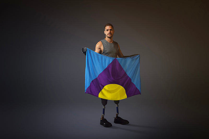
The Meningitis Flag: A UNIQUE GLOBAL SYMBOL TO HELP DEFEAT THE DISEASE BY 2030
August 28, 2023
Earlier this year I was invited by Leith design agency in Edinburgh to work on co-creating a global symbol for meningitis with them and the meningitis community, including Meningitis Research Foundation, the Confederation of Meningitis Organisations (CoMO), Sanofi and three para-athletes affected by the disease: Ellie Challis (Great Britain), Théo Curin (France) and Davide Morana (Italy).
The idea was to create a flag design to be the first ever global symbol created for and by the meningitis community to raise awareness of this serious disease.
Over the course of four months I worked intensely researching, designing, collaborating, sharing, presenting and tweaking designs with an incredible team of people to make this flag design you see here today. A design that I feel so proud to have been part of.
Meningitis is a potentially devastating disease that can strike at any time. Affecting more than 2.5 million people globally each year, one in ten will die of the disease with 50% of these deaths occurring amongst children aged five and under. Despite significant progress made over the last 20 years, meningitis is still the world’s 6th largest infectious disease killer.
Knowing how potentially devastating this disease can be through a family member contracting the disease at a very young age, it felt hugely important to me to not only accept Leith's invitation to work with them, but to make sure I did the meningitis community justice with what we created.
After an incredible co-creation process with athletes, MRF, CoMO and Sanofi, we arrived at a final design that is simple, bold and vibrant.
The idea of 3 is a key element in the design, developed from research, conversations, and co-creation sessions. The three represents the 3 meninges, the idea of “protect, support, defeat” and the meningitis community - individuals, their families and wider levels of support.
We have 3 layers of shapes and colours within the design.
The yellow semi-circle represents the patient as the bright, hopeful centre of the movement, symbolising that every individual is important.
Wrapping it in care and support it is a purple triangle - a nod to families and the meningitis community. It is pointing upwards like an arrow, representing speed and positivity in the race against meningitis.
The final layer is a sea of blue, symbolising a sense of steadfastness and a calm determination in the wider movement to defeat meningitis.
There is global aim to defeat this disease by 2030 and I hope that the creation of this symbol helps contribute towards that goal. Everyone that worked on this project was amazing, I heard so many incredible stories and witnessed so much hard work to get us to this final design.
Finally, I urge everyone to educate themselves about the symptoms of meningitis and to read more about the symptoms of this disease here.
--------------------
CLIENT: Leith / Sanofi
CO-CREATED WITH: The Meningitis Research Foundation (MRF), The Confederation of Meningitis Organisations (CoMO) & three para-athletes affected by the disease: Ellie Challis (Great Britain), Théo Curin (France) and Davide Morana (Italy).
YEAR: 2023
FLAG MATERIAL: 100% silk crepe de chine
COUNTRY OF MANUFACTURE: Scotland (The Centre for Advanced Textiles at Glasgow School of Art)
HERO FILM directed by: Juriaan Booij, RSA films
HUGE THANKS to: Ellie, Théo, Davide, Brian, Nikki, Marion, Joe, Camilla, Kat, Grant, Thea and all at Leith, Elaine, Sam and all at MRF, Barbara, Gwen, Alex and everyone at Sanofi, Alan, Laura & Vicki at CAT, Juriaan, Jamie and everyone that worked on the films - this whole project was an amazing team effort and collaboration of many minds.


The Sculpture House Dye Garden - Pilot Year
April 01, 2023
The Sculpture House Dye Garden is a project I initiated with the help and support of Sculpture House artist Laura Aldridge, Sculpture House and anthropologist/designer Charlotte Linton.
Based in Ferguslie Park, Paisley the Sculpture House Dye Garden aims to not only support and enrich my own creative practice as a textile designer by looking at more sustainable ways of making work but also that of Sculpture House and the wider community.
Our pilot year of the Dye Garden project ran from April 2023 - April 2024 and was fortunate to receive funding from both the Renfrewshire Community Climate Fund and Creative Scotland to enable us with practical requirements to establish the garden itself such as building and filling raised beds, as well as funding towards a programme of educational workshops and events. This enabled us to offer the following three outreach programmes from the garden:
1. The FERGUSLIE DYE GARDENERS
This was a free, fortnightly drop-in workshop for Ferguslie residents where we followed the growing cycle of the plants from seed to flower to harvest. Then we turned the harvested plants into our own textiles over the winter months.
2. The PRIMARY SCHOOLS PROJECT
This is a project that began in May 2023 and ran until October 2023 with the P4/5s from the two local primary schools - St.Fergus & Glencoats. The aim was to educate and inspire the pupils about where colour comes from, how we can create colour from plants and sustainability in textiles through growing their own dye plants at Sculpture House to work with.
A free monthly events programme that ran from May to November 2023 curated by myself and Charlotte Linton. Every month we invited a different artist/designer/practitioner to deliver either a practical workshop or talk for the public exploring the ideas around natural dyes, sustainability in textiles and
The Socials so far have been:
May - Bawn & Rejean in conversation
June - Elisabeth Viguie Culshaw: Botanical Printing on Paper
July - Teresinha Roberts: an Allotment to Dye for talk
August - Woollenflower : A Local Colour workshop
Sep - An Enthusiasts Introduction to Eco Printing with Laura Aldridge
Oct - Cavan Jayne in Conversation
To find out how we are moving forwards into the next growing seasons and beyond, please read this project page.
-------------------
COLLABORATORS: Sculpture House (Laura Aldridge), Charlotte Linton
YEAR: 2023 and ongoing
FUNDERS (pilot year 2023): Renfrewshire Community Climate Fund, Creative Scotland
PHOTOGRAPHY: Caro Weiss
News & Updates
Sign up to get the latest on sales, new releases and more…
© 2026 Laura Spring.